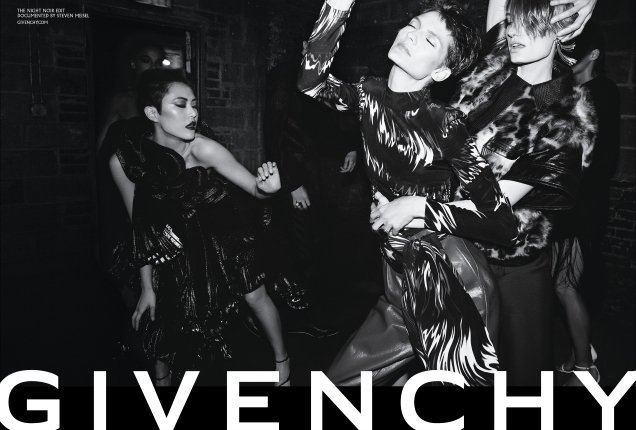
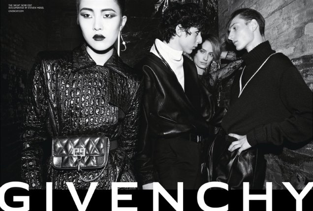
Clare Waight Keller made the brilliant move to hire legendary lensman Steven Meisel for her very first Givenchy campaign last season. Welcomed back again for Fall 2018, Meisel ditches the ambiance of a private mansion in favor of a dark and moody nightclub setting. Models Karolin Wolter, Sohyun Jung and Veronika Kunz and a bunch of male models party up a storm in the stark black and white campaign images, with styling from Suzanne Koller.

Our forum members weren’t too impressed with Givenchy’s latest. “It’s lacking something I can’t pinpoint. It feels very plain and the composition is annoying,” said YohjiAddict the second the campaign came to light.
“It’s basic as hell. No life, no energy. If anyone but Saint Meisel had shot this, everyone here would be ripping it apart,” stated mepps.
“It’s very been-there-done-that, and has no ‘Meisel Magic.’ I really dislike Clare’s Givenchy,” complained gazebo.
[ Not a tFS forum member yet? Click here to join! ]
Sharing the same sentiments was forum member guimon. “Her Givenchy seems so… irrelevant. Like, literally who are these people?” they questioned.
Grimm wasn’t exactly thrilled either: “It feels very dated, from the lighting to the concept to the layout. I just don’t understand her point of view. I guess the saving grace is that were it in color it would look a bit like ASOS, so the B&W is giving it that tiny hint of luxury.”
“Looks like a mix between Terry Richardson and Mario Testino… not a good look for Meisel,” voiced 333101.

See more from the campaign and share your thoughts with us here.


