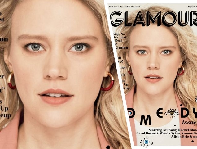
Three months later and our forum members still can’t figure out what Samantha Barry was thinking when she introduced Glamour‘s questionable redesign with the May 2018 issue. Following in the footsteps of Melissa McCarthy and Anne Hathaway, Kate McKinnon becomes Glamour‘s latest victim as she stars on the August 2018 issue. Photographed by Miguel Reveriego and styled by Vanessa Chow, the American actress and comedian serves passport photo realness in the questionable close-up portrait.

Another month, another issue our forums will be passing by at the newsstand. “Besides the horrid cover, the ‘Authentic. Accessible. Relevant’ tagline has me reaching for the sick bucket,” said 333101 the moment the cover struck.
“What on earth is happening with fashion magazines!! Sigh,” added Miss Dalloway.
“It’s heartbreaking for us longtime fans. They’re doubling down on stupid in their efforts to attract fickle millennials,” replied Handbag Queen. “What a mess of a cover. All three from this new EIC have been horrid. Great hire, Glamour!”
[ Not a tFS forum member yet? Click here to join! ]
Also not exactly jumping for joy was fluxxx: “This looks like a mugshot, and to make it even worse, they added that hideous layout.”
“Their new design never fails to make me laugh,” voiced MDNA.
“The fonts! The new Glamour reminds me of someone who just got Windows 3.1 and was dabbling with MS Paint. The title font is just so unprofessional looking. Not to mention that Wingdings crap they have going on for the ‘comedy’ title. Which is the only thing that might make it pop on the newsstand, because the photo sure doesn’t,” wrote lavieenrose.
“Is the magazine surviving this redesign?” asked biagiolr.
Benn98 wasn’t here for it either. “Yikes, this is atrocious! Looks like an awkward passport snapshot of Kate,” he pointed out.
Check out Kate’s cover feature and join the ongoing debate here.


