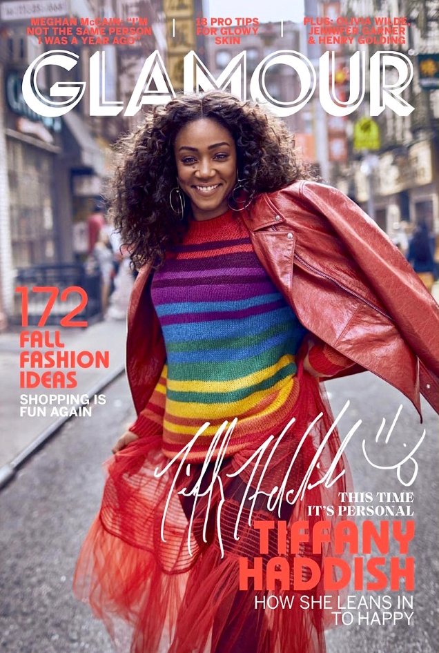
Our forum members haven’t exactly been shy about weighing in on Glamour‘s “atrocious” new look, calling out the magazine’s EIC Samantha Barry for a series of unfortunate-looking covers featuring the likes of Melissa McCarthy, Anne Hathaway and Kate McKinnon. Thankfully, there are some small signs of change with the September issue, including the absence of the huge, obnoxious border around the cover image and an image shot outside of the magazine’s go-to studio setting. American comedian and actress Tiffany Haddish makes her Glamour debut this month, captured on the streets of New York by photographer Billy Kidd and styled by Law Roach.

Of course, the cover wasn’t a total home run. “Horrible cover. They already need a new EIC. Glad the ridiculous border is gone,” commented Handbag Queen the moment the cover struck.
Mikel wasn’t here for it either. “And the border is gone Very happy to see Tiffany on the cover of a September issue. Too bad it’s such a bad shot with questionable styling,” he said.
“Everything about this new art direction is completely wrong. I saw the Kate cover on the newsstand and it disappeared visually. That masthead is a disaster, it simply doesn’t stand out. Worst decision they could have made. Readers like the consistency of a familiar masthead. A magazine that’s been around as long as Glamour shouldn’t change that up,” pointed out dfl-001.
[ Not a tFS forum member yet? Click here to join! ]
“Who exactly is Glamour’s target audience? Teenagers? This is something I’d expect from Seventeen Magazine or Teen Vogue,” called out JessRubik.
“Well, at least they’re outdoors. That’s it for me. The retro font doesn’t work and the coral is too light for the setting, and what’s with the styling? I’m afraid I can’t really abide Tiffany. Every time she opens her mouth she just comes across as obnoxious. Her mouth will be her downfall,” slammed Benn98.
Also not a fan of the styling was 333101: “She’s done well to smile through the pain of being put in that get-up. This is probably their best cover since the redesign, but I can’t get past the styling!”
“This actually looks… good. For the first time, the new logo worked. The layout needs work,” confessed MON.
A hit or miss this month? See more from Tiffany’s cover story and share your thoughts here.


