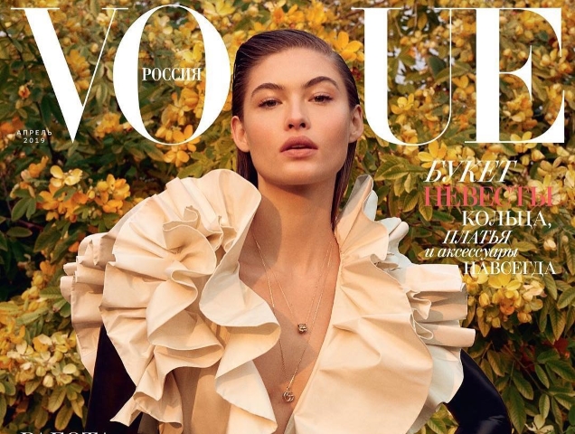
We’re pretty into Grace Elizabeth right now, so it’s thrilling to see the all-American beauty get the recognition she deserves. Is it any wonder she’s welcomed back to the cover of Vogue Russia for a third time? Our forums are currently campaigning for Anna Wintour to give Grace the cover of American Vogue, but right now we’re content with covers of Vogue Brazil, Vogue Korea and Vogue Turkey to compensate.
Following a duo of androgynous Bella Hadid covers last month, Grace brings femininity back for April 2019 in a ruffled Gucci number on the spring-like cover, striking a pose before the lens of Yelena Yemchuk and stylist Daniela Paudice.

Although Grace’s latest received praise, it didn’t exactly enthrall our forum members like her past covers did.
“Lucky it was Grace, her face still manages to stand out; a blander model could’ve easily disappeared completely. Despite the lack of contrast against the background I still like the cover. Grace is easily one of the best cover girls we have at the moment in my opinion,” commented Morgane07.
“I always look forward to Vogue Russia’s spring covers. The sentiment is really nice here and I love her, but her face looks just a bit weird,” wrote Srdjan.
“It’s a nice attempt. I like the pose and I like Grace. The problem here is obviously the styling and the background. It just blends together. This tricky dress would look better on a more neutral background eventually. Grace still manages to make it work though,” Valentine27 echoed.
[ Not a tFS forum member yet? Click here to join! ]
Sharing the same love towards Grace was vogue28: “I like it, love the fact Grace lands yet another Vogue cover, the colors and how the texture of the greenery behind complements the ruffles of the Gucci dress.”
Benn98 picked out a few qualms with the cover, writing, “Too beige, and the white masthead almost disappears. I’m sure the styling looked really stunning on a clotheshorse, but once you stick it on the tanned Grace Elizabeth in front of that tree, it all sort of meshes together and not in a good way. Stylistically speaking, a darker skinned model would’ve been better. Or move her away from that tree!”
In agreement over the clash between setting and styling was tigerrouge. “This makes you realize there is an art to UK Bazaar‘s landscape/garden shots, because I can’t recall seeing one where the clothing competed with the background to the point where they canceled each other out,” she posted.
Check out the cover shoot with Grace (and a much more worthy cover shot) and join the conversation here.
[ Next: Grace Elizabeth Gives Vogue China Its Best Cover in Ages ]


