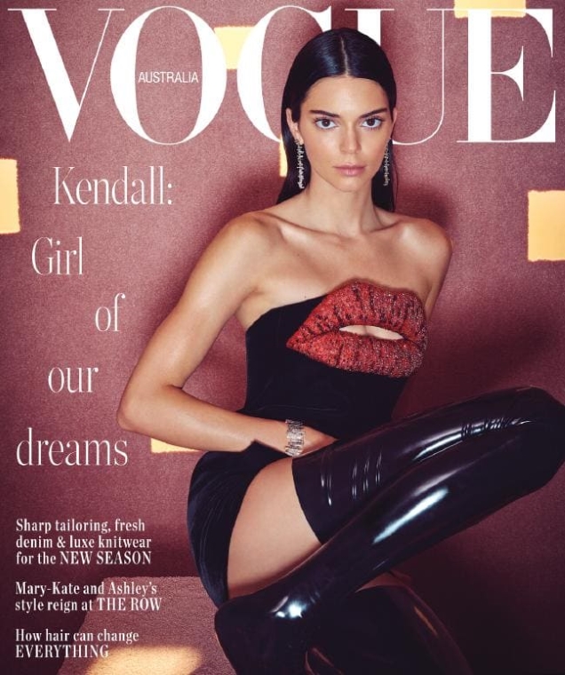
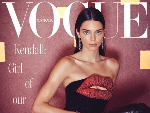
Kendall Jenner’s portfolio is looking pretty good right now, having amassed a healthy amount of blue-chip advertising campaigns and magazine covers in recent months. She’s the current face of Roberto Cavalli, Stuart Weitzman, Calvin Klein, Tiffany & Co. and has recently been on the cover of Allure, Vogue Italia and Vogue Russia. So we aren’t surprised to see Vogue Australia welcoming the model of the moment back on its cover for a second time. Shot by Charles Dennington and styled by Jillian Davison, Kendall sits perched in Saint Laurent and jewelry from Tiffany & Co. in the June 2019 cover shot.

“This is so bad,” proclaimed caioherrero the moment the cover struck.
“And here I thought she was getting better. This is rather pathetic at this point,” wrote marsnoop2.
[ Not a tFS forum member yet? Click here to join! ]
Sharing the same lack of enthusiasm was Benn98: “Come on, Denno! You’re better than this. I don’t think it’s an awful cover, just that the retouching on her face is crazy. Everything is just too perfect and android-like.”
“Ugly cover. Not just because of Kendull. Nothing works,” complained mikel.
“Might as well hire a mannequin and you wouldn’t know the difference,” ranted Style Savvy.
Hafyiez wafa soon asked, “Why does Vogue Australia always use that ugly font?”
“How can Vogue magazine, in 2019, think that text looks acceptable?” echoed MyNameIs.
“Oh no, what a bad shot. And to make it even worse…that hideous text,” declared apple.
A setback for Kendall’s portfolio? Sound off and join the conversation here.


