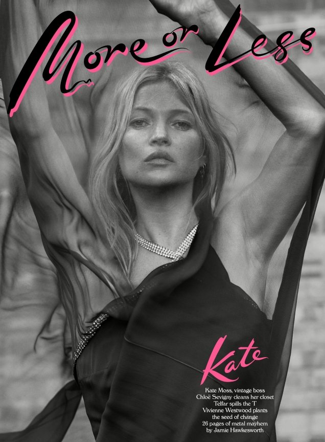
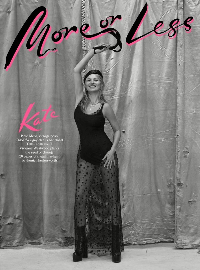
After the sudden announcement last week that Interview was shutting down after five decades of publication, we welcome the news of a fresh new fashion magazine hitting the market. More or less, a biannual fashion publication that promises to champion “creativity over cost and consumption” is headed up by Jaime Perlman, the former creative director of British Vogue. The magazine enlisted Brit supermodel and ultimate fashion icon Kate Moss to appear on two debut covers photographed by Ethan James Green, with Kate wearing pieces from her own vintage clothing collection.

First impressions are lasting impressions, right? Unfortunately, the covers failed to make an impact with our forum members. “Very underwhelming debut. What’s that masthead, and the title isn’t very creative at all? I suppose after years and years of running all those Kate Moss covers under Alexandra they naturally formed a bond. So to go with Kate for your first issue is very clever,” noted Benn98.
Sharing the same sentiments was dfl-001: “You go from British Vogue that had an oversaturation of Kate Moss and start a new title with… Kate Moss. Tiresome!”
[ Not a tFS forum member yet? Click here to join! ]
“This is not good! Jaime was amazing in the documentary for BBC. I was expecting more and she gave less,” caioherrero complained.
“The masthead looks like a cheap version of Interview‘s former masthead,” MON pointed out.
Also not impressed was Velasco: “Yuck! Tired and boring. And not sure if I’m referring to this cover concept or the model. Probably both!”
“Lazy cover, very lazy,” ivano added.
Karl Boucher, however, seemed to disagree with the majority. “She is Kate ****ing Moss and I will like anything she does,” he said.

Which cover would you go for, if any? Join the conversation here.


