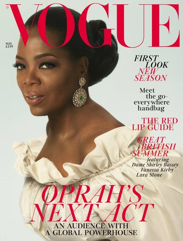
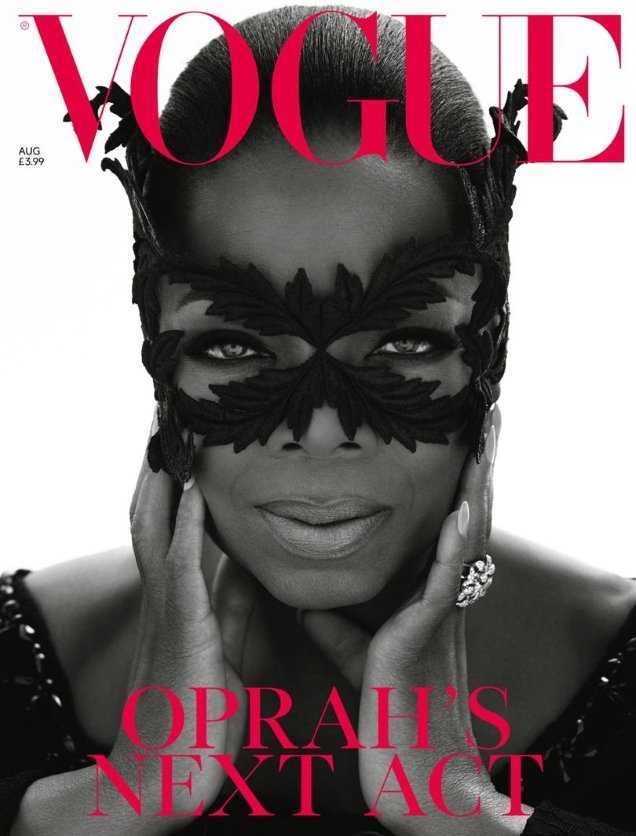
Edward Enninful continues to give the industry and newsstand a refreshing overhaul. He just awarded Ariana Grande her very first Vogue cover appearance last month, brought Cara Delevinge and Steven Meisel together for the first time the month prior and gave us a dosage of diversity back in May. Keeping standards up, Enninful drops yet another memorable cover featuring none other than… Oprah! The American philanthropist and global superstar receives the Mert Alas & Marcus Piggott treatment, styled by Enninful himself in a custom Stella McCartney gown, resulting in a regal, refined and sophisticated newsstand cover (below). For the black and white subscribers cover (after the jump), Oprah channels her inner superhero.

It was simply love at first sight for our forum members. “Um… this is WONDERFUL. Oprah looks as glamorous and beautiful as she’s ever looked. It’s a stunning photograph of her,” raved happycanadian the moment the cover dropped.
“The image is gorgeous, Oprah looks amazing… everything about it works perfectly for me actually,” shared LastNight.
[ Not a tFS forum member yet? Click here to join! ]
“This is a real wow moment for me, I don’t even notice the layout because of Oprah’s elegance and that beautiful color palette. Mert & Marcus have actually done an incredible job of capturing her beauty,” dodencebt applauded.
In agreement over how wonderful the cover turned out was Nepenthes. “In love with this. Oprah looks regal and totally gorgeous,” he admired.
The subscribers cover (below), left a LOT to be desired by our forum members. “Can’t believe he published that sub cover!! That should have stayed as an outtake reject that it is!” Miss Dalloway exclaimed.
“The subscribers cover is an eyesore,” MON confirmed. “What a cheap knockoff of Lara Stone’s Vogue Paris cover. It doesn’t look good. The hand placement looks real stiff and awkward. She seems like she’s looking down. Her head should’ve been held high. Not good. Pretentious at most!”
GinAndTonic shared the same sentiments, writing, “Pretty gutted I’m gonna get the subscriber one! It seems to me the lace mask is really out of place. It has that sexy connotation that doesn’t work here at all. I much prefer the newsstand cover.”

Which cover do you prefer? See more from Oprah’s cover shoot, await the contents of the issue and join the conversation here.


