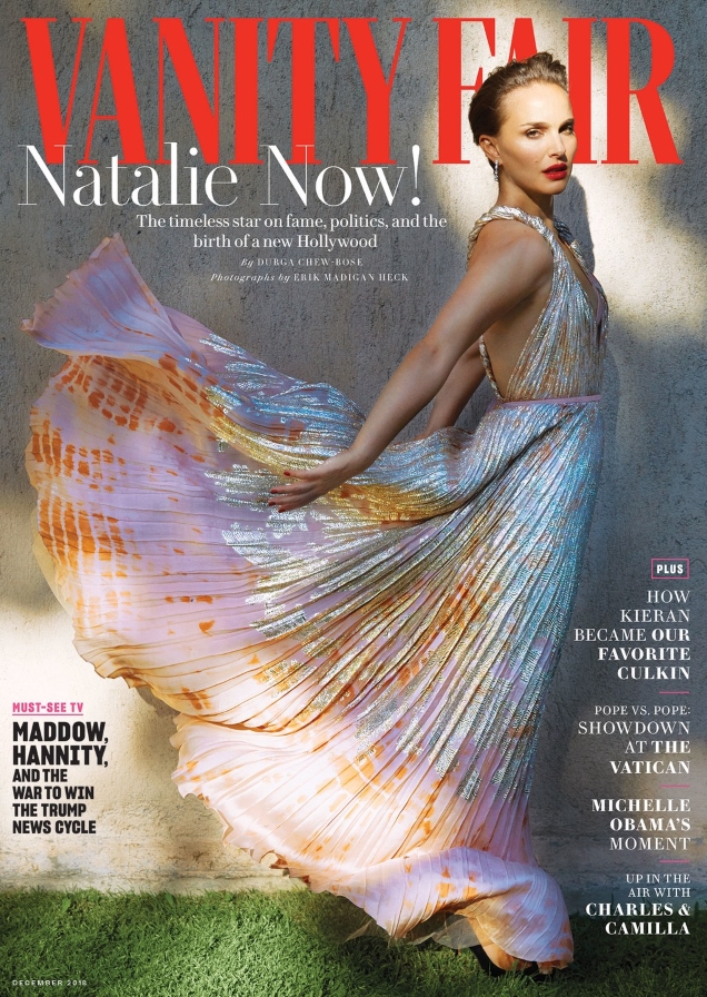
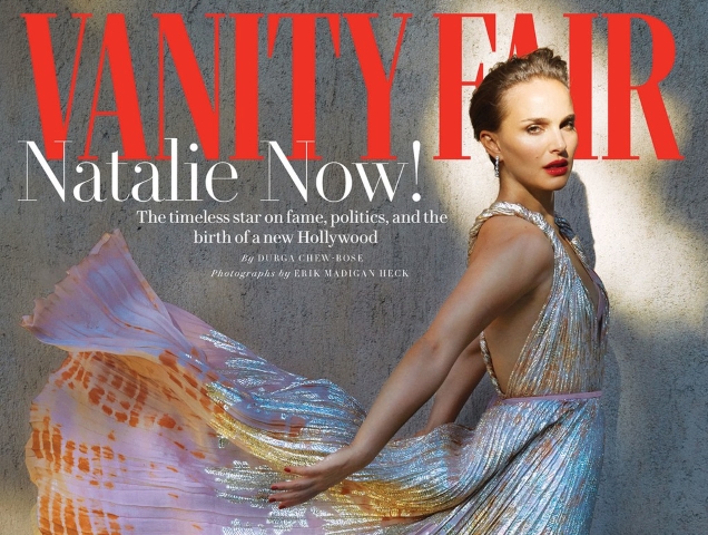
This has been a tough year for Vanity Fair and our forums have been on the magazine’s case ever since Radhika Jones was appointed Graydon Carter’s successor. Jones’ first outing as editor-in-chief arrived in the form of a weird or wonderful Jennifer Lawrence cover for March, which was shortly followed up with a paparazzi shot (*shudders*) of Prince Harry and Meghan Markle. (Dare we even mention that Michelle Williams September cover?) The publication was no doubt in a rush to put out its final offering of the year in a bid to start afresh in 2019, but not before doing a disservice to Natalie Portman. The actress was photographed for the cover of the December 2018 issue by Erik Madigan Heck and styled by Samira Nasr, giving us a hint of festive glamour in a shimmering Christian Dior dress (Natalie is the face of Dior cosmetics).

The magazine’s attempt at something a little fashion-forward fell flat amongst our forum members. “We would have known this was a blatant advertorial even without tagging the brands, Vanity Fair,” remarked dodencebt the moment the cover struck.
“Wait, they really went with this for the cover? Mid-air jump face expression and all? My god is this woman completely clueless as to what makes a decent cover, or what!” slammed Miss Dalloway.
“Nothing about the cover really quite works for me. The sunlight on only three-quarters of her face makes her look very washed out and severe,” sweetpop chimed in.
[ Not a tFS forum member yet? Click here to join! ]
GivenchyHomme wasn’t a fan of the harsh lighting either. “That lighting isn’t very flattering is it,” he said.
Also left unimpressed was forum member Ken Doll Jenner: “With some cropping or a different angle, the cover could work. Radhika must’ve thought that the drama of the hemline should not go to waste, which explains why she picked this cover. Wrong move.”
“Natalie is such a beautiful woman, but that cover shot is not flattering. The light is so harsh and severe on her face, and her gaping mouth doesn’t help either. This is another miss for Radhika,” stated mepps.
“They turned her into a brunette Carolina Herrera and aged her about 20 years,” said chinsumo.
Care to see more? Check out Natalie’s cover feature (where there’s a far more suitable image for the cover) and share your thoughts here.


