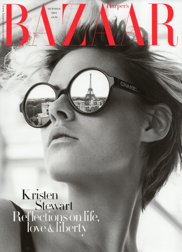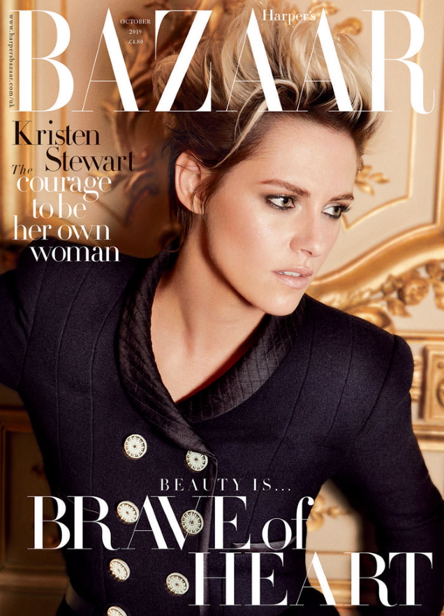
The subscribers’ cover immediately became a topic of discussion on our forums. “That’s a lovely cover. Love the reflection in her glasses,” admired mikel.
“Vogue Paris could never,” applauded jorgepalomo.
“This looks like an advert for Chanel, but the image is undeniably beautiful…” KissMiss confessed.
[ Not a tFS forum member yet? Click here to join! ]
Sharing the same sentiment was [Piece Of Me]: “It does look more like an advert for Chanel sunglasses (I bet Chanel provided some $$ to this cover), but it is certainly a lovely cover. Vogue Paris, are you watching?”
Bertrando3 was also full of praise. “The very first time I see this girl emoting and truly giving a great photo. It does look like an ad and not like a cover, but it’s a superb image. You can also appreciate the Eiffel Tower, it’s a very French cover for a British magazine.”
But not everyone was impressed. “Nothing about this excites me…” complained Miss Dalloway.
“Both the newsstand and subscribers’ covers are terrible. The hideous hair color and that lifeless expression? Not for me. Content better be good because I’ll easily skip seeing this on my coffee table,” declared Benn98.

See Kristen’s cover feature in all its glory and share your thoughts here.


